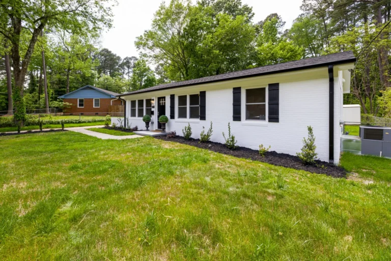

Exterior Paint Color Combinations for Houses: 12 Field-Tested Pairings
The fastest way to transform a tired facade isn’t a new roof or new siding. It’s paint. And the difference between a house that looks “nice” and one that stops people on the sidewalk almost always comes down to the combination, not the individual colors. Choosing the right exterior paint color combinations for houses means coordinating the body, trim, and accents so they work as one system instead of three competing swatches.
Pick a great body color but a mismatched trim, and the whole scheme falls flat. Get the pairing right, and even a dated 1960s ranch can look intentional and current. The good news is that you don’t need a design degree. You need a formula, some real-world pairings, and a willingness to test samples in your own light.
This guide walks through a simple three-part system, then gives you a dozen exterior paint color combinations for houses that have proven themselves on real homes across the U.S., Canada, and Australia. We’ll cover how to match a scheme to your architecture, why your sample chip lies to you, and what a full repaint actually costs.
Why the Right Combination Matters More Than Any Single Color
Paint is the cheapest high-impact exterior upgrade you can make. A full professional repaint of a 2,000-square-foot home typically runs $3,000 to $7,000, while new siding can run $12,000 to $30,000 for the same house. When the return is that lopsided, the details that separate a good paint job from a great one are worth getting right.
A coordinated scheme does three specific jobs. First, it draws the eye to the architectural features you want people to notice — a front door, a gable, a porch. Second, it hides the elements you’d rather downplay, like an oversized garage or a dated roofline. Third, it anchors the house to its surroundings so it looks like it belongs on the lot rather than floating on it.
Most color “mistakes” aren’t bad colors. They’re bad relationships between colors. A warm beige body next to a cool blue-gray trim reads as muddy. A pure white trim against a soft off-white body washes out entirely. The combinations in this guide are built to avoid exactly those clashes.
The Three-Part Formula: Body, Trim, and Accent
Every exterior scheme breaks down into three layers. When you assign a job to each layer, the combination almost builds itself.
The Body Color
The body is the largest surface — siding, stucco, brick, or shingles — and it sets the emotional temperature of the house. On most homes the body color should be the most neutral of the three, because it’s the color you’ll live with across the largest area. Deeper body colors (charcoal, navy, forest green) are rising in popularity but read as bold; light-to-mid neutrals remain the safest resale play.
The Trim Color
Trim covers fascia, soffits, window and door casings, corner boards, and railings. It frames the body. A classic scheme uses white or off-white trim to create crisp contrast, but warm wood tones, black, and even matching body tones are common in modern farmhouse and craftsman looks. The trim is where most DIY schemes go wrong — too many homeowners pick a “safe” trim that’s actually a slightly different undertone from the body, and the result looks unintentional.
The Accent Color
The accent is the front door, and sometimes shutters, garage doors, or a porch ceiling. This is your permission slip for a bold color, because it covers so little surface area that even a saturated coral, teal, or black works. A single front door painted a confident accent color can change the personality of the whole house for under $100 in materials.
Photo by Anton Mokeev via Pexels
12 Exterior Paint Color Combinations for Houses That Work in Real Life
Here are twelve pairings, organized roughly from safest to boldest. Each lists the body, trim, and accent so you can hand the list straight to a painter or a paint store.
- Warm white, soft black trim, black door. Sherwin-Williams Alabaster body, Tricorn Black trim and door. Timeless on cottages and modern farmhouses alike.
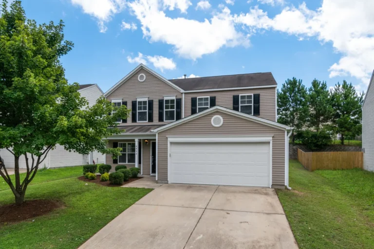
- Greige, white trim, navy door. A warm-gray body like Agreeable Gray with Pure White trim and a deep navy door reads polished without being cold.
- Sage green, cream trim, charcoal door. Earthy and calm, ideal for craftsman bungalows and homes surrounded by greenery.
- Light blue-gray, white trim, red-orange door. A coastal classic; the warm door keeps the cool body from feeling icy.
- Cream, warm wood trim, forest green door. Natural and grounded, a strong fit for mid-century and ranch homes.
- Slate blue, white trim, black shutters. A traditional colonial pairing that has never really gone out of style.
- Soft tan, white trim, terracotta door. Warm and southwestern, with enough contrast to stay crisp.
- Pale yellow, white trim, gray-blue shutters. Cheerful and classic, best on Victorian and farmhouse styles.
- Light gray, white trim, burgundy door. Neutral and safe up top, with a deep accent that adds weight at the entry.
- Charcoal, white trim, natural wood door. Modern and high-contrast, popular on new builds and updated ranchers.
- Navy, white trim, brass-and-wood door. A bold but livable choice that photographs beautifully.
- Forest green, cream trim, rust-orange door. Deep and dramatic; pairs well with stone and brick accents.
If you want a quick side-by-side view of four standout schemes, here’s how they stack up:
| Combination | Body | Trim | Accent | Best For |
|---|---|---|---|---|
| Modern Farmhouse | Warm white | Soft black | Black | Cottages, new builds |
| Coastal Calm | Light blue-gray | White | Coral red | Beach, bungalow |
| Craftsman Earth | Sage green | Cream | Charcoal | Bungalow, craftsman |
| Modern Contrast | Charcoal | White | Natural wood | Contemporary, ranch |
Photo by Rain Photography via Pexels
How to Match a Combination to Your Home’s Architecture
The same colors look completely different on a Victorian than they do on a mid-century ranch. Matching the scheme to the style prevents the “painted the wrong era” look that drags down curb appeal.
Craftsman and bungalows suit earthy, muted tones — sage, olive, taupe, and deep browns — with cream or warm-white trim. The style leans heavily on natural materials, so a stained wood door or porch accents fit better than a high-gloss bright accent.
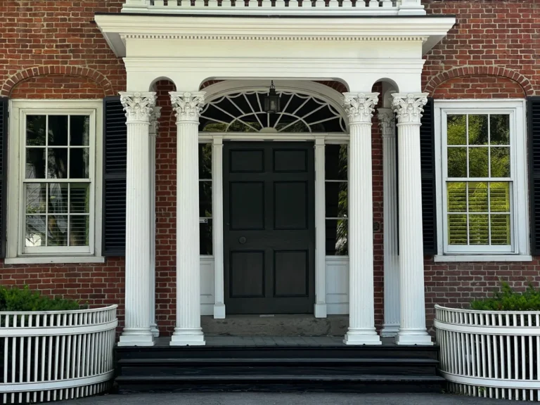
Colonial and traditional homes were built for high contrast. White or off-white trim against a mid-tone body, plus dark shutters, reinforces the symmetry these homes are known for. Stick to classic combos rather than trend colors if you plan to sell within a few years.
Modern farmhouse thrives on near-neutral bodies (white, light gray, greige) with black or charcoal trim. The contrast is the style. A natural wood door or a matte black door finishes the look.
Mid-century modern and ranch homes can carry warm woods and earthy accents — think cream body, warm wood panel or trim, and a burnt-orange or olive door. Avoid stark white trim, which can feel too harsh against the warm palette.
Coastal and Mediterranean homes favor light, bright bodies (white, sand, light blue) with crisp white trim and saturated accents like teal, coral, or navy on doors and shutters.
If you’re unsure where your home falls, spend twenty minutes driving your own neighborhood and photographing houses with the same roofline and massing. The combinations that already work on similar homes are your safest shortlist.
Undertones, Light, and Why Your Sample Looks Wrong
The single most common complaint after an exterior paint job is “it looked different in the store.” That’s not a paint failure — it’s an undertone and lighting problem, and it’s predictable.
Undertones are the hidden color inside a color. Two “gray” paints can look identical on a chip in fluorescent light, yet one dries with a blue undertone and the other with a brown one. Place a blue-gray trim next to a beige body and the cool/warm clash becomes obvious on the wall even though each color looked fine alone. When building a combination, pick colors that share an undertone family — warm with warm, cool with cool — unless you’re deliberately going for contrast.
Light changes everything. North-facing walls receive cool, indirect light and make warm colors look duller and cool colors look bluer. South-facing walls get strong direct sun that bleaches colors lighter than you’d expect. A color that reads as a rich navy on the north side may look almost black on the south side. Test each candidate on multiple exposures, not just the front porch.
Scale matters more than the chip suggests. Paint colors appear roughly 10% lighter and more saturated over a large wall than they do on a two-inch chip. When in doubt, order the next-lighter version of the body color you’re drawn to; almost everyone who skips this step wishes they’d gone lighter.
The fix is cheap and boring: buy sample quarts, paint two-foot squares on at least two different walls, and check them at morning, noon, and dusk for a full day before you commit.
What It Costs to Repaint a House
Exterior paint color combinations for houses don’t change the price much — color choice is essentially free, which is the point — but the overall job cost is worth understanding before you get attached to a scheme.
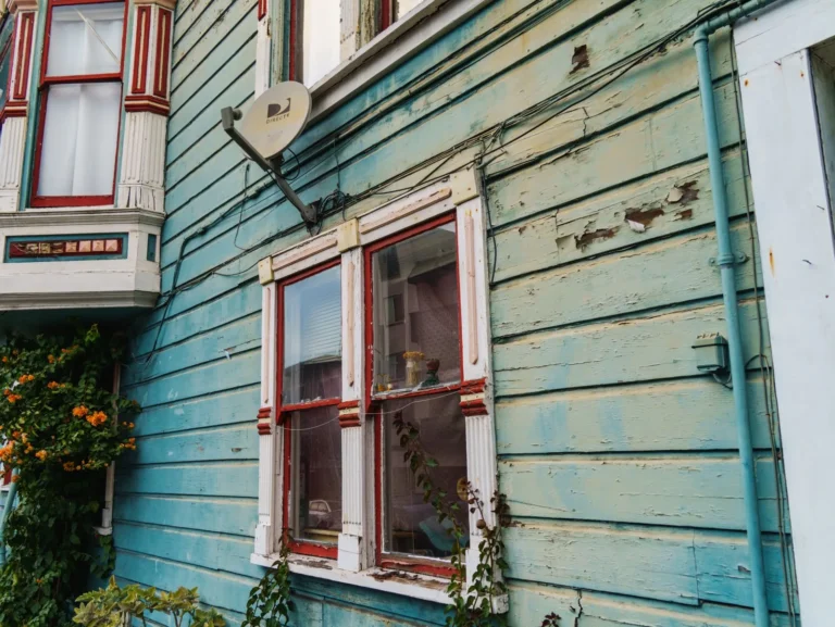
Professional exterior painting in the U.S. averages roughly $1.50 to $4.00 per square foot of wall area, or about $3,000 to $7,000 for a typical 2,000-square-foot home, including prep and two coats. Prep is the variable: a house with peeling paint, wood rot, or heavy mildew will cost more to bring to a sound surface before the first drop of new paint goes on.
Here’s a rough breakdown of where the money goes:
- Labor (70–80%) — washing, scraping, sanding, priming, caulking, and spraying or brushing.
- Paint and materials (20–30%) — premium exterior paint runs $40 to $80 per gallon, and a 2,000-square-foot home often needs 10 to 15 gallons total across body, trim, and accents.
- Extras — scaffolding for tall homes, lead-paint abatement on pre-1978 houses, and specialty finishes like limewash all add line items.
DIY drops the bill to mostly materials — often $700 to $1,500 for a full repaint — but the tradeoff is time, ladder work, and surface prep quality. If your home is two stories or has significant prep needs, a pro with insurance is usually the better value.
Frequently Asked Questions
What are the most popular exterior paint color combinations for houses right now?
Warm white or greige bodies with black or charcoal trim dominate the current trend, especially on modern farmhouse and transitional homes. Sage green with cream trim and a charcoal door is the fastest-rising earthy alternative, while navy with white trim remains a steady classic. Check our best exterior paint colors for 2026 for the full trend picture.
Should the trim be lighter or darker than the body?
In a traditional scheme, trim is usually lighter than the body to create framing contrast. The modern farmhouse trend flips this with dark trim against a light body. Either works as long as the contrast is deliberate — a trim color that’s only slightly different from the body tends to look like a mistake.
How many colors should an exterior have?
Three is the sweet spot: one body, one trim, and one accent for the door and shutters. Go to four only if you have a distinct feature like a porch ceiling or gable that you want to highlight. More than four reads as busy and dilutes the effect of the accent color.
Do I need to paint the garage door the accent color?
No — in most cases the garage door should blend with the body or trim rather than shout for attention, since an oversized garage is rarely the feature you want to emphasize. Paint it the body color to visually shrink it, and save the accent for the front door.
Can I pair a cool body color with warm trim?
Only intentionally, and usually with a neutral bridge. A cool blue-gray body next to a warm cream trim will clash because of clashing undertones. If you want warmth against a cool body, bring it in through a wood-stained door or natural accents rather than through the trim paint.
For a deeper look at selecting trim specifically, read our guide on how to choose an exterior trim color, and see what’s coming next in exterior paint color trends for 2026.
The Bottom Line
The right exterior paint color combinations for houses come down to a simple discipline: assign a job to each layer, keep the undertones consistent, and test in real light before you commit. The body sets the mood, the trim frames it, and the accent delivers the personality — usually for the price of a single gallon on the front door.
Start with a body color you can live with for a decade, then build outward. Grab samples, paint test squares on two different exposures, and look at them at three times of day. If you follow that process, the twelve pairings above will get you 90% of the way to a facade you won’t have to second-guess.
Before you buy paint, it’s worth confirming you’ve picked a product that will actually hold up. The paint experts at This Old House walk through the full exterior painting process, and Better Homes & Gardens has a solid library of real-home color examples to help you visualize the final result.